Explore My Latest Work
The hardest part of UX isn’t deciding what to add; it’s deciding what to get rid of.
I've helped modernize three data-heavy legacy applications used to manage user permissions, simplifying complex workflows without disrupting familiar ones.
Most of my work is under lock and key. 🔐
NDAs make for great job security, but not always the best portfolio pieces. Here are a few redacted, low-fiedlity glimpses of my design work.
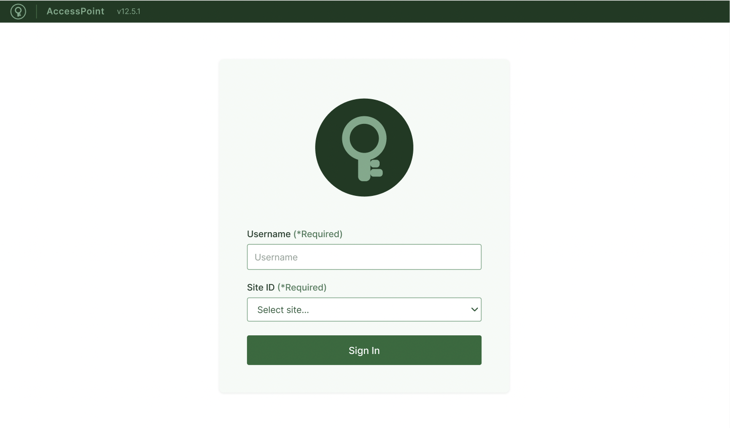
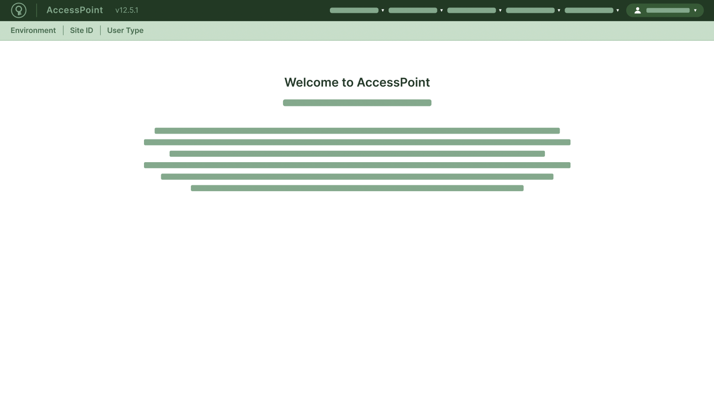
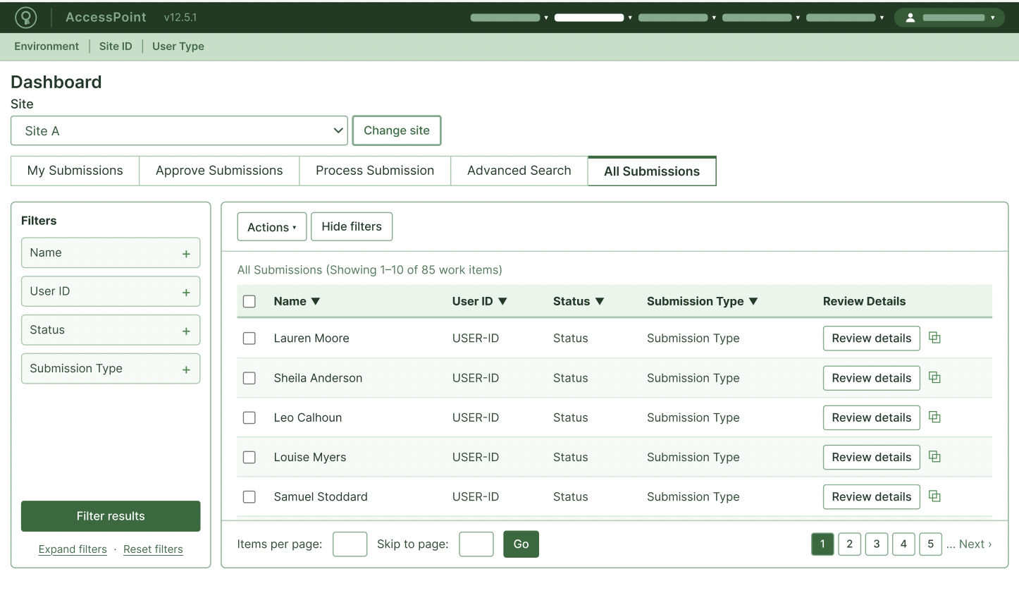
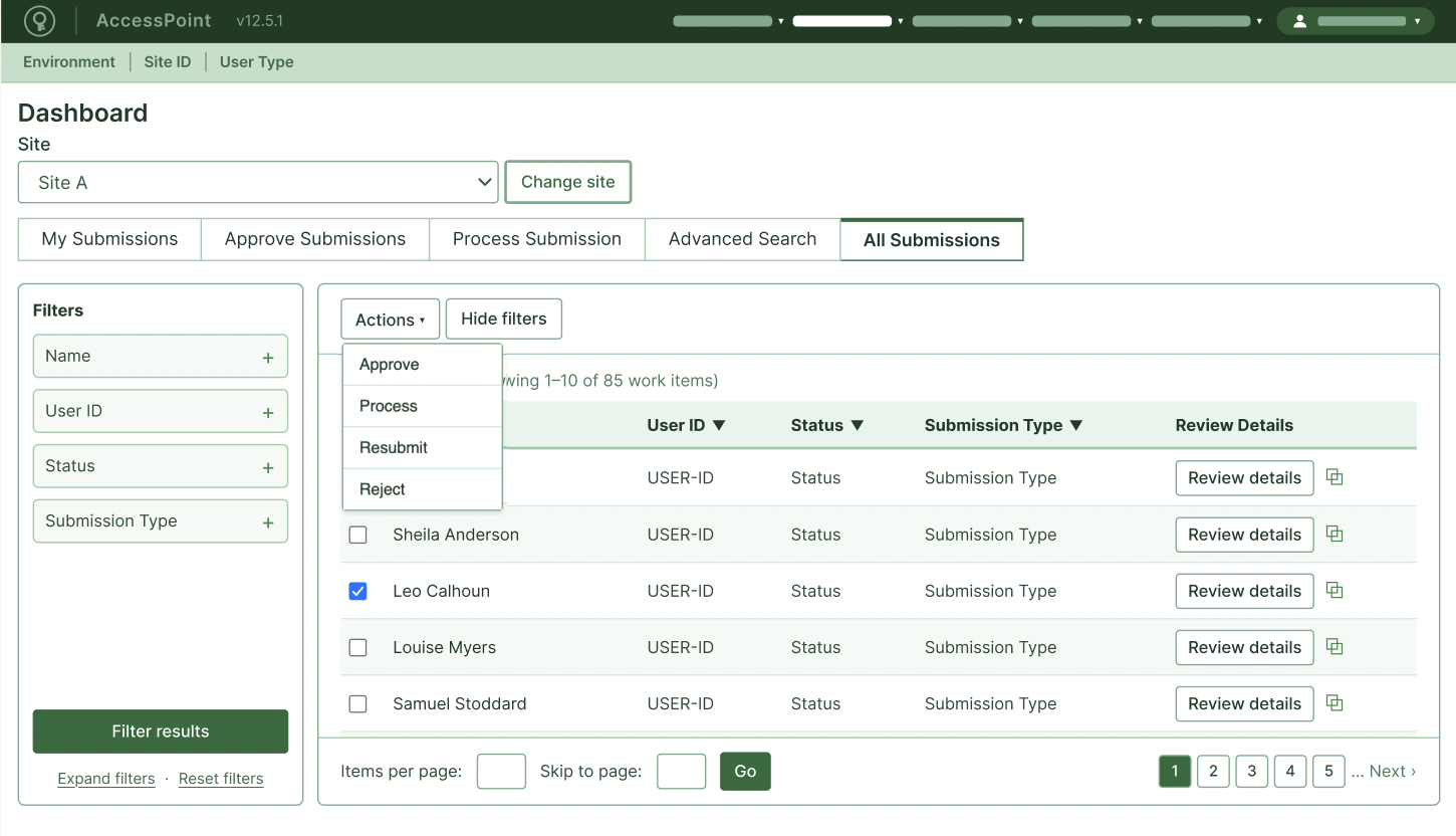
Request Dashboard Workflow
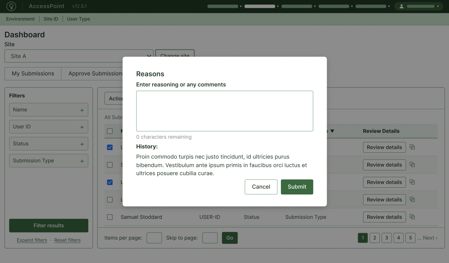
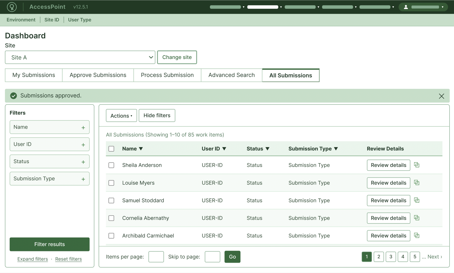
Users had to dig through multiple pages and submenus to initiate requests. I consolidated these workflows into a single dashboard, making them easier to find and manage.
Impact: Less clutter. Fewer clicks. I removed unnecessary columns, simplified filtering, and enabled bulk requests in just 3 clicks. Load time went from 5 minutes → 3 seconds.


Words Matter
Making complex products easier to understand, one word at a time.
Buttons
Before: Initiate New Request
After: Create request
Why: I replaced technical language with a familiar action and removed unnecessary words. The goal was to make the action immediately scannable and reduce hesitation.
Modals
Before: Are you sure you would like to proceed with the deletion of this item? Please be advised that once this item has been deleted, it will no longer be available for viewing or editing.
After: Delete this item?
You won't be able to recover it once it's deleted.
Why: The original copy buried the consequence inside a long sentence. I separated the decision from the consequence so users could understand what was happening at a glance.
Headers
Before: User Account Information Management
After: Account information
Why: Shorter doesn't always mean better. Make it simpler, without losing the point.
Instructions
Before: In order to proceed with the aforementioned request, users are required to provide all applicable information within the fields below.
After: Enter the information below to continue.
Why: Removed formal, passive language and unnecessary words while keeping the instruction intact.
Errors
Before: Please enter a valid email address before continuing.
After: Enter a valid email address to continue.
Why: “Please” is polite. It’s also unnecessary. Error messages should help users understand what went wrong and what to do next. Removing filler words keeps the message clear and action-oriented.
Navigation
Before: Manage User Information
After: Account
Why: Reducing cognitive load and avoiding unnecessarily technical labels.